During the summer we squeezed in a small but delicious reception make-over in a residential building in Mayfair adjacent to Green Park.
A good reception area is such an important element to a building. It’s the first thing you see as you walk in. So, do we wish to make a good impression or a bad one? If you’re selling or renting an apartment, the reception area can close the deal. It’s sad that so many of our buildings are let down in this area when this can be easily remedied, and everyone can benefit in the short and long term.
One of our clients reached out to me for the re-design and project management of this space. A modern 70's building of no architectural significance with the apartments purchased for the use of a limited number of residents, over 2-3 floors for each apartment.
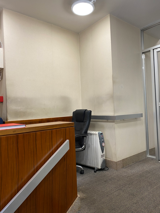
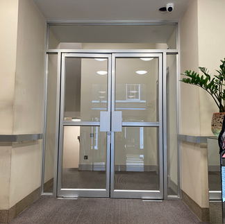
There have always been a number of high-profile visitors to the building, and yet the reception had not been touched for at least 20 years; it was tired and dated.

These are some before photo's - I think you can see what I mean!

The project needed to be executed within a very tight time frame, for the arrival of one of the high-profile residents. There was an existing reception desk that we decided to work with, as it would take too much time to replace and disrupt the area which still needed to be used for access.
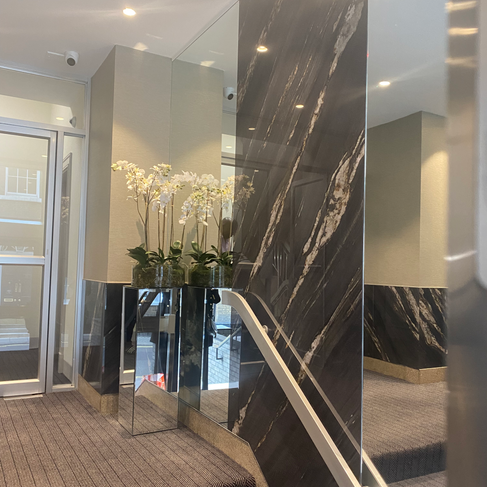
I decided to limit the modification of the desk and clad it in a large format porcelain tile, 5mm thick. The tile was also used on the walls as well as mirror. We created a design that replaced the carpet, mirrors, and ceiling lighting and provided a new storage cupboard in the corner.
Two colour concepts, one light, and one dark were produced and submitted to the residents, see below.


The residents chose the darker colour scheme which is visually more dramatic. In the final version, we increased the amount of tile and mirrors on the walls behind the desk. The doors to the storage unit were fluted using a C&C machine and then painted in the workshop.


I contacted our tiling specialist from Huds Tiling. Ken is particularly fastidious and detailed focused with a team of equally excellent tilers. He jumped at the chance to clad a piece of furniture in tile as it is something that's not normally done. To do this accurately and cut down on cutting time he suggested we use a company called Tailor Made UK which measures and pre-laser cuts the tile for each section of the desk and wall, the tile can also be vein-matched too.

The tile was specified from Porcelain Tiles UK which specialises in large format thin printed tile from Italy - sustainable luxury for environments. The final tile used for this project was Cosmic Black.
Here are some of my personal photos of the finished work, we are waiting on professional photographs, but I think you will agree, a much-improved space.

Final finishes
Final finishes
Final finishes
Contact us if you have any design requirements for receptions or specialist design work - we are here to help!
✨ Contact Us Here ✨


Kommentit